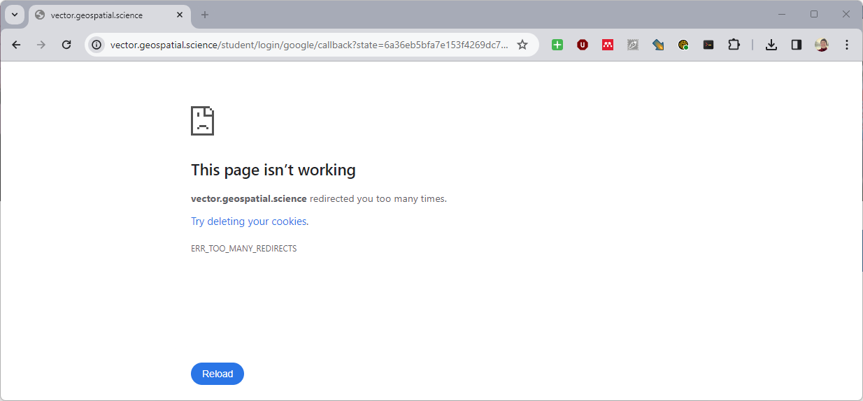
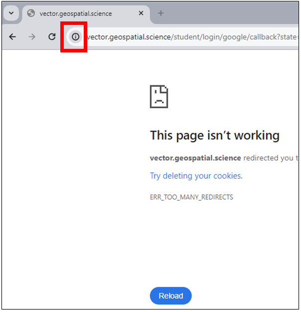
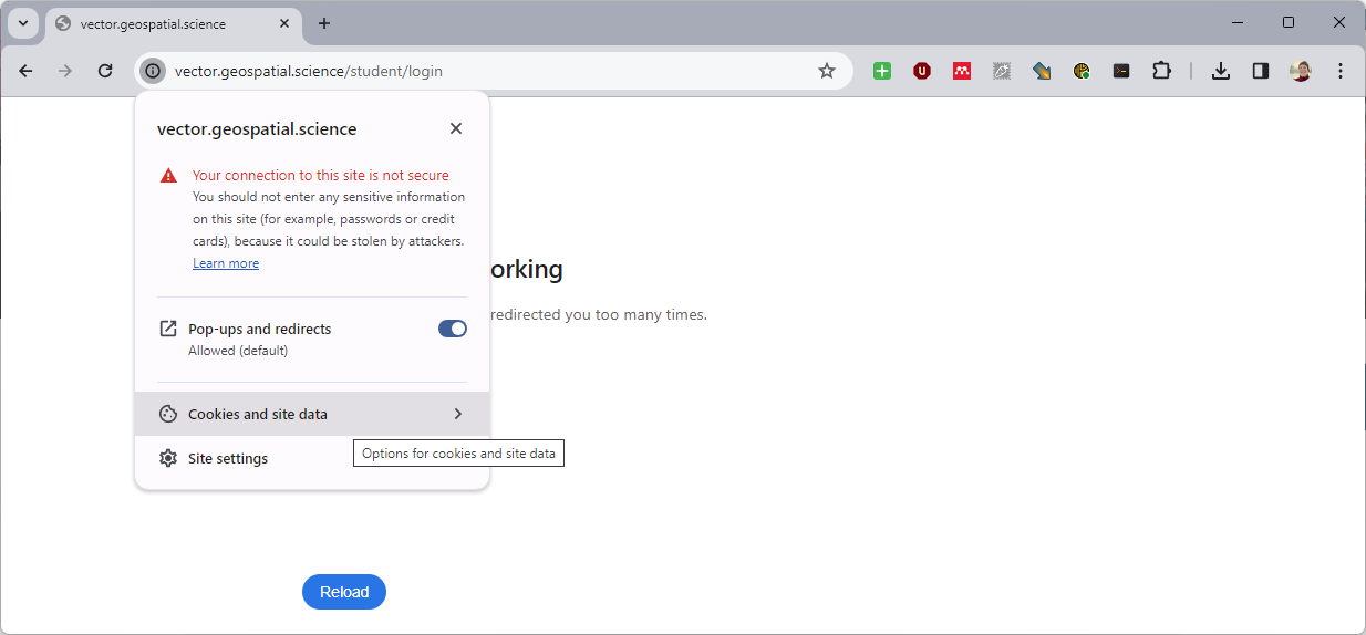
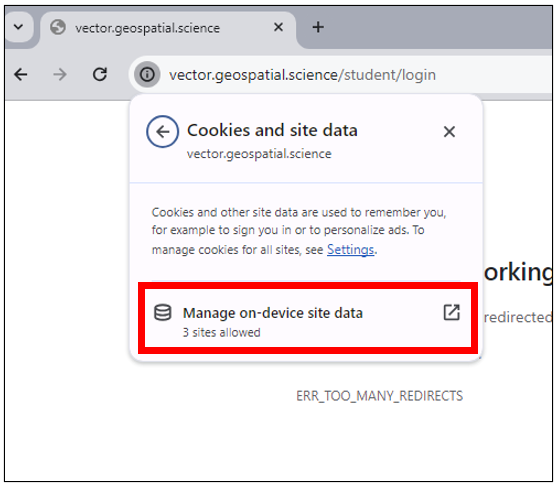
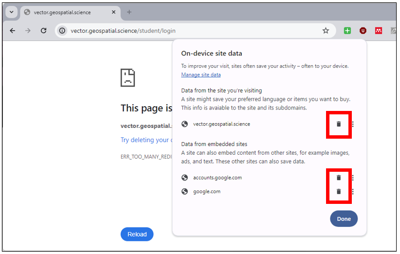
Login Redirect Error Workaround
If Chrome is saying: "vector.geospatial.science redirected you too many times. Try deleting your cookies. ERR_TOO_MANY_REDIRECTS." after clicking the Login button, do the following to fix it.
|  |
|  |
|  |
|  |
|  |
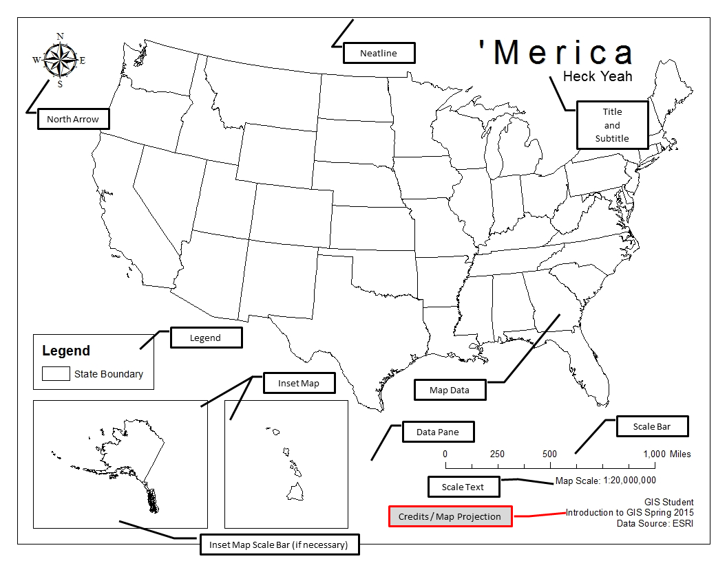
Layout View Overview
Layout View is the area of ArcMap where the cartographic layout is created.

Switching from Data View to Layout View
While there is no "real and correct" way to work through creating a layout (cartographic product) in ArcMap, this guide will show you one logical flow of going from data analysis completion to exporting a PDF of the final product. This guide will also show you some tricks in Layout View, such as how to align objects and how to pan/zoom the data participating in a layout vs. how to pan/zoom the entire layout page (aka. the entire map itself). Use the links on the left to jump to a desired section.
Within ArcMap, the data analysis portion of your project is completed in Data View while the creation of a cartographic product/map/layout is completed in Layout View. The two views are kept separate and you are allowed to bounce back and forth between the two.
- Please note that in ArcGIS for Desktop (aka. ArcMap and ArcCatalog) you are only allowed one layout per MXD. This means that if you need to make a different layout, for example - a different size of the output map, a different basemap, or a series of different cartographic elements, you'll need to do a "Save As..." to complete a different layout. Changes in your layout are permanent, and you can only use the Undo action back to the last save point.
- ArcGIS Pro (introduced and used in Intermediate GIS), however, allows for multiple layouts within a single project (MXD).
There are two main ways to change from Data View to Layout View - via the View menu in ArcMap or via the buttons found at the bottom of the actual data frame (not the Data Frame Properties)
|
 |
|
 |
|
|
|
|
Print and Page Setup (Setup How Your Page Looks)
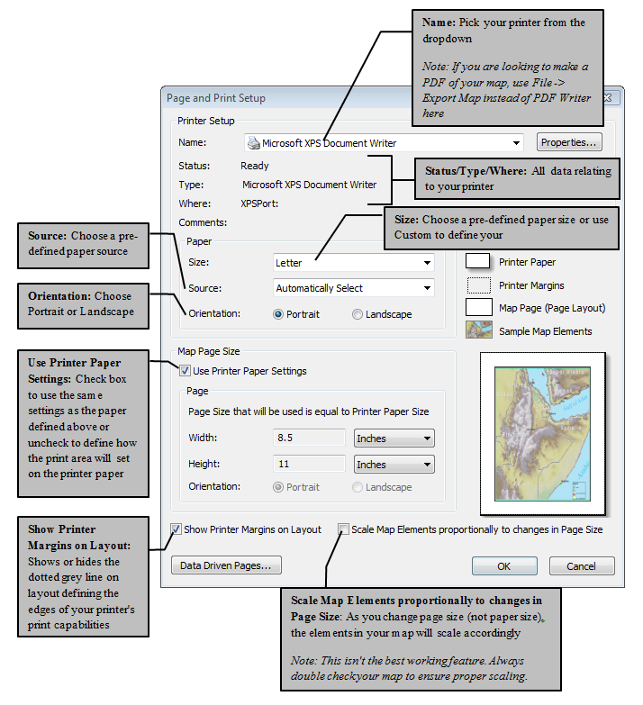
The first thing that will help you to start a successful layout is to decide which way your paper should be turned: portrait or landscape. The general rule is to turn the page the same direction of your data. For example, a map of the Lower 48 would fit best in landscape mode while California would fit best in portrait view.
- Open the Page and Print Setup dialog box via File > Print and Page Setup
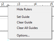
Using Guidelines in Layout View
Layout view allows you to set and use guidelines to which map element can snap to for alignment and spacing purposes. There is no limit to how many guidelines you can place in one layout.
|
Guide lines are a built-in feature that create a snap line to line up map elements.
|
 |
Using Print Preview
As you move through the cartographic process, it’s important to check your work along the way. Using the Print Preview option will show you what your final map will look like after printing or exporting. Looking at a preview of your map often will show you where things fall outside of the print margin, allowing you to fix it before cascading error becomes a problem.
To use Print Preview:
|

|
Panning, Zooming, and Centering Data in Layout View
When you switch over to layout view, you are presented with the Layout toolbar. This toolbar, where the icons look similar to the Tools toolbar, is how you pan and zoom the whole page not the data. To pan and zoom your data within the data frame in layout view, continue to use the pan and zoom tools found in the Tools toolbar.
| Use the Layout Toolbar to pan and zoom the whole page. | Use the Tools toolbar to pan and zoom your data within a data frame in Layout view. |
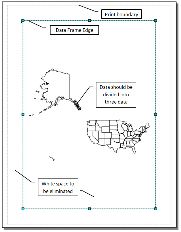
Map Data and Data Frames

All maps must have at least one data frame (or pane) and some data within that map. Using the Insert Menu, we can insert as many data frames as deemed necessary to best convey the message of our map. Data frames help us to eliminate white space as well as provide a place for an overview (showing the location of a county within a state) or focus map (showing a congested downtown area among a bike path map). Sometimes, the data will be spread out across a large geographic area, such as a map of the United States which includes Alaska and/or Hawaii or a map that focuses on the East and West Coasts, but excluded Middle America. Using the Data Frame Properties, we can change the projection of each data frame. In cases where the data should be represented in all the same projection, such as with overview and focus maps, data is most often copied from one data frame to the next. Knowing that the first layer added to a new data frame dictates the projection it will take, by setting a projection for one layer (using the Project tool if necessary), the copying that layer to other data frames will transfer that projection. Also knowing that a Data Frames projection will project all the layers on the fly, you can also just change the projection for the data frames individually.


Selecting Appropriate Map Projections
Selecting an appropriate map projection to properly display your data is both an art and a science. ArcMap is capable of "projecting on the fly", or displaying data is a projection it's not stored in. While it's important to remember, for accuracy and precision reasons, to keep you data all your data in the same projection for analysis reasons, it's not always necessary to re-project your data just to display it.
In order to select a projection, one must first define the parameters of the project. Asking questions such as:
- What is the map output?
- What is the overall purpose of the map? #Which of the six distortions (shape, area, distance, direction, bearing, scale) am I trying to reduce? Which of the six can I give up?
- What is the desired accuracy and precision of the map?
- What is the extent of the map?
By understanding what it is you need in a map and what you overall goal is, making a projection selection will be much easier.
Map Output
With so many options of map outputs (digital, GeoPDF, hardcopy, web maps, interactive web maps), the projection must first and foremost match the output. For digital, hardcopy, and static web use, the following guidelines are most likely appropriate, while maps designed for interactive web use might be best used with a special "Web Mercator" projection. The Web Mercator projection is a special version of the Mercator projection designed for use at all scales, allowing users to change the extent of the final product.
Overall Map Purpose and Distortions
One of the most important questions you can ask in regards to choosing the appropriate map projection is how will the output map be used for ''this project''. Defining the end use of the map will help you decided which of the six distortions you are willing to give up and which of the six are a definite keeper. For example, maps that will be used for navigation need to preserve distance, direction, and bearing and could probably do without shape or size, since the overall purpose is the get from point A to point B with the best travel plan. However, thematic maps, for which the purpose is to display attribute data and compare one geographic region to another, do not really need to preserve distance, direction, and bearing and would benefit much more from preserving shape, size, and scale.
Projections to Reduce Specific Distortion
Certain projections are designed to reduce specific error throughout a map. Starting with the developable surfaces, we will look at five of the more common methods used to reduce specific distortion: equal area, conformal, equidistant, true direction, and compromise.
| Equal Area | |
| The goal of equal area maps, as the name suggests, is to create a map where each of the land masses represented is given an equal amount of area. Equal area projections are useful where relative size and area accuracy of map features is important (such as displaying countries / continents in world maps), as well as for showing spatial distributions and general thematic mapping such as population, soil and geological maps. Looking at the distortion ellipses, we see the shape is distorted but the area remains constant throughout. | 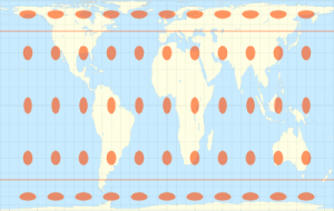 |
| Conformal | |
| Conformal maps serve the purpose of preserving shape, distance, and bearing, at the expense of area and scale. Just like in the West Wing clip and the BuzzFeed "Maps Lie", it is explained continents away from the Equator are larger in size. When we understand that it is impossible to preserve all six characteristics and conformal maps, such as the Mercator projection, aim to preserve shape and distance, we then understand that Mercator had no intentions of "lying" to anyone, nor did he want to create social inequality. He just wanted a quality map to navigate with. Preservation of shape, distance, and bearing makes conformal map projections suitable for navigation charts, weather maps, topographic mapping, and large scale surveying. In the image, we see the distortion ellipses as circles. This tells us the shape is preserved, but area is distorted away from the Equator. Looking at this image, is the Mercator projection a tangent or secant developable surface? | 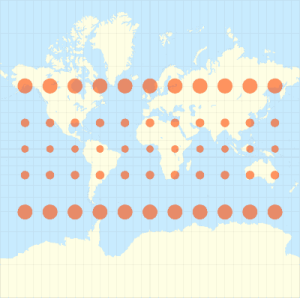 |
| Equidistant | |
|
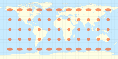
Equidistant, similar but different then conformal projections, aim to preserve distance, but only from the line or lines of tangency. This means that when you use an equidistant map, the measured distance from the place where the developable surface came into contact with the globe will be correct, but distances measured between other points will be incorrect. Equidistant projections are used in air and sea navigation charts, as well as radio and seismic mapping. They are also used in atlases and thematic mapping. In the image, we see the ellipses as circles which are not distorted in shape or size at the equator, but become increasingly so as you move away. When compared to the conformal example, we see the continents becoming distorted in shape, but the distortion ellipses do not stop far from the north and south edges. |
 |
| True Direction | |
|
Similar to the equidistant projection, which starts with a cylindrical developable surface, true direction starts with an azimuthal developable surface. Much like your oblique gnomonic projection, all directions and bearing away from the Washington Monument are preserved, but if you were to measure between Los Angeles and New York, the measurement will be incorrect. True-direction projections are used in applications where maintaining directional relationships are important, such as aeronautical and sea navigation charts. |
|
| Compromise | |
|
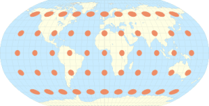
Compromise projections attempt to balance all of the distortions in one map. This means that none of the six are "perfect", but each one is is balance with the others, the idea being that no one place is grossly distorted in comparison to any other place on the map. Compromise maps are used to preserve the look of the finished product, a wall or book map, for example. Two common types of compromise maps are the Robinson and Winkel Tripel projection (both of which we will look at in lab). In the image, which is a Robinson projection, we see none of the ellipses are terribly distorted in size, shape, or distance from each other. But because they are all distorted in all six ways, this map wouldn't be perfect for navigation, nor preserving area for measurements, nor comparing the shapes to a globe. |
 |
Accuracy and Precision (and Distortions)
Second, and related to the overall map purpose, is the desired accuracy and precision of the output map. Again, the purpose must be known in order to define the desired accuracy and precision. If the map is for navigation, selecting a projection which preserves the accuracy of distance and direction measurements is of the utmost importance while a thematic display map has a much larger tolerance of error. Since we know that precision in mapping is how exactly a feature or attribute represents the best-known real world measurement, for a particular thematic map, the precision of the features and attributes being represented may the most important factor. Selecting a projection which preserves the distortion in a way that meets the project's demanded level of accuracy and precision is extremely important.
To review:
- The extent of a map is the maximum area displayed as defined by the geographic coordinates of the four corners.
- Distortion is increased the further away from the tangent or secant line or line one moves across the developable surface))
- Specific projections are best used with large scale (small extent) areas while others are best used with small scale (large extent) areas. By determining the desired extent of the map, combined with the established distortions to reduce, selecting a projection becomes easier, since some projections are designed for large scale areas while other are designed for small scale areas.
Grouping and Aligning Map Elements in Layout View
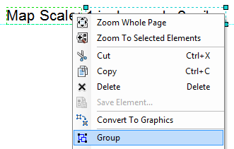
In addition to using guide lines, another excellent way to insure the elements in your map's layout are neatly lined up are to use the align and grouping options. Align will align items to either the margins or each other while grouping items will create one larger item which contains several smaller items. However you line them up prior to grouping is how they will group together.
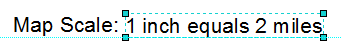
Let's look at how we'd group a text box that says "Map Scale:" with a dynamic scale text box.
Grouping Items
|
 |
|
 |
|
 |
|
 |
|
 |
Aligning Items
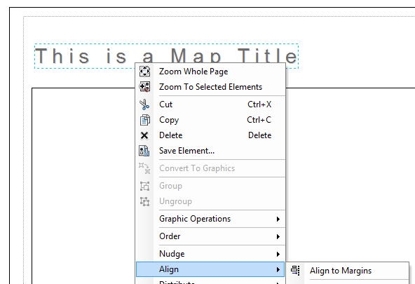
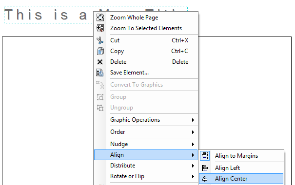
Items can be aligned to the margins of the page, like if you wanted to center a title on a page, or to other items, like if you want to center an image to a rectangle you drew. To align items to the margins:
|
 |
|
 |
|
 |
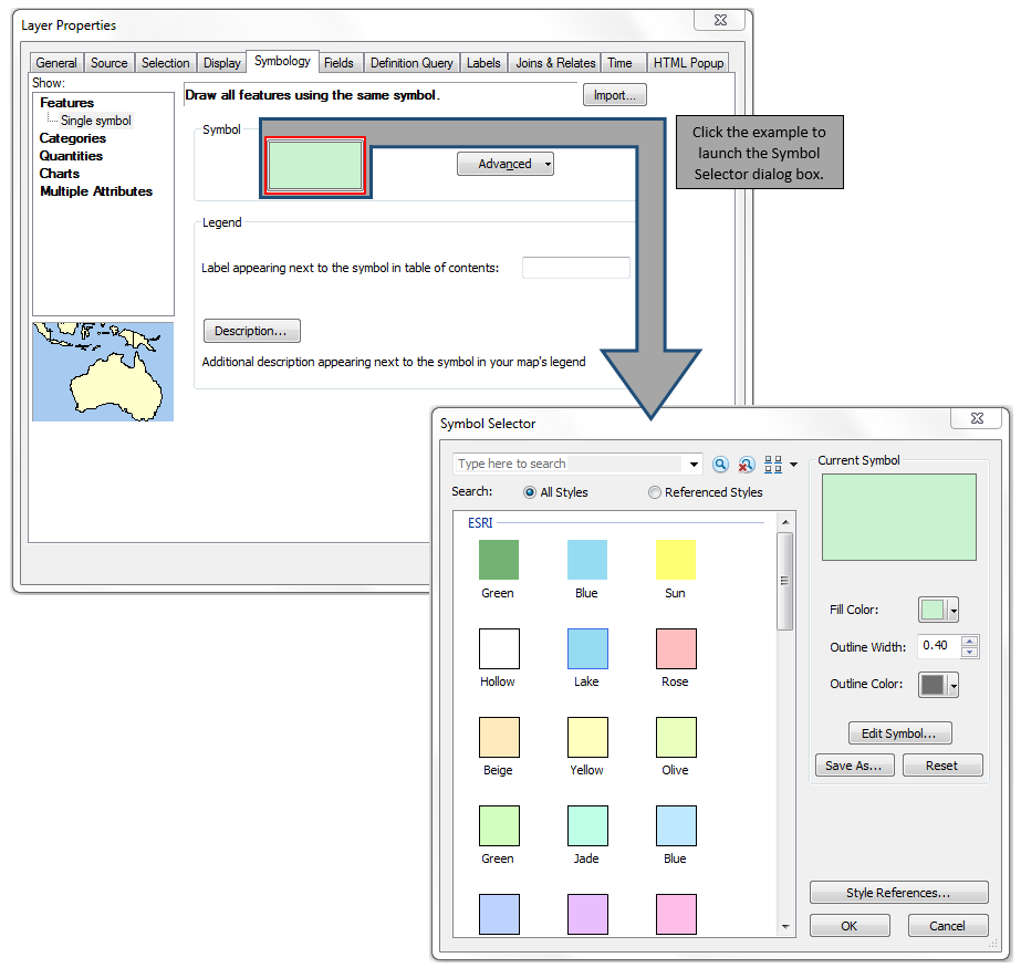
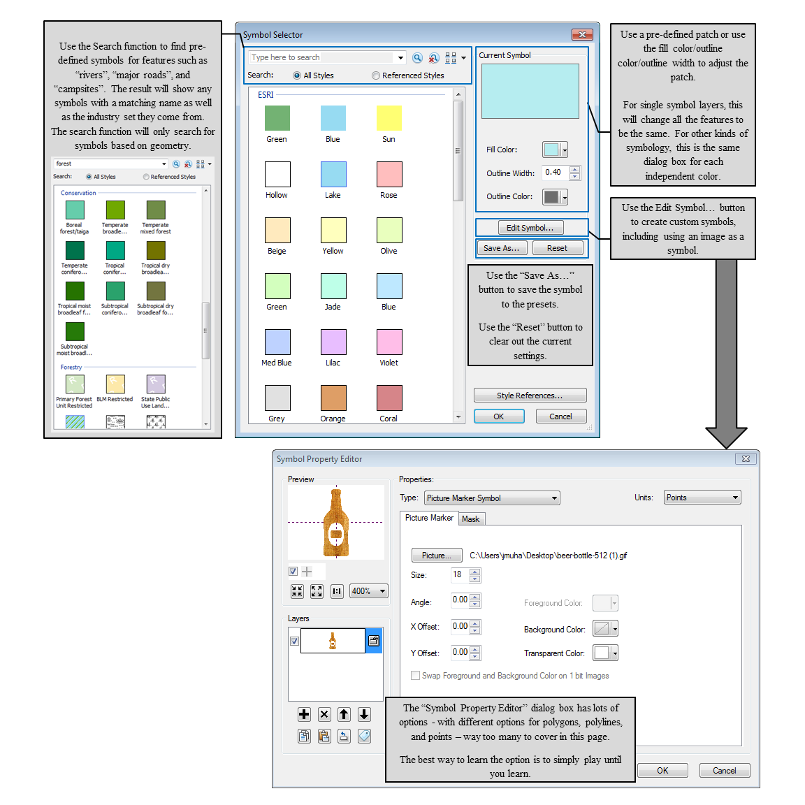
Symbology

Symbology can be changed in three different places - the Symbology tab of the Layer Properties, by single left clicking a patch in the Table of Contents, and by right-clicking a patch in the Table of Contents - each one with less control then the one prior. The Symbology tab offers the most choices and should be used almost exclusively if the layer is not being represented by a single symbol (that is, all the features are colored identically and no field is defined). Single left-clicking on a patch (point, polyline, or polygon) in the Table of Contents will launch the Symbol Selector dialog box (click to jump to the explanation of how-to), which allows you to make many changes in the size, color, and style of a single symbol, as well as create your own symbols. Right-clicking on a patch (point, polyline, or polygon) will allow you to change only the color.
Included in Symbology is the ability to change the display labels are displayed within the Categories, Quantities, Charts, and Multiple Attributes.
Click on the type name to jump to the section for a more in-depth explanation and how-to images.
- Use the Features symbology set for coloring all the features in a layer in the same manner (the default setting when adding a layer to ArcMap
- Use the Categories symbology set for text or date fields.
- Use the Quantities symbology set for numeric or currency fields.
- Use the Charts symbology set to add a pie, bar/column, or stacked chart using two or more numeric fields to each feature.
- Use the “Multiple Attributes” symbology set for numeric or currency fields where you need to create unique values combining two or more fields.
Other options for adjusting symbology include:
- Importing the Symbology from one layer to another, assuming they share at least one value in the attribute table to symbolize by
Symbology Show: Menu - Features
The features window will color all of the features the same way. Click on the current symbol to open the Symbol Selector dialog box where you can set the fill color (polygons), outline color (polygons and polylines), or point symbol.
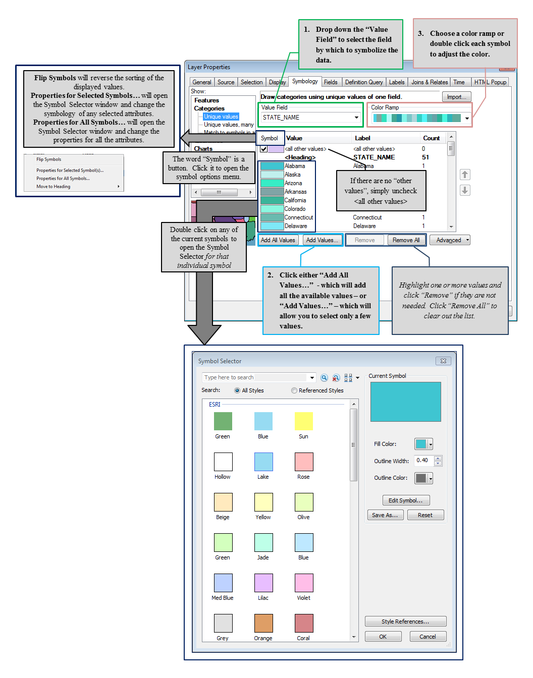
Symbology Show: Menu - Categories
Symbology by Category will allow us to display data based on one or more field. For example, if we want to color each county of Colorado a different color, we can set the symbology to Category, make the value field “County_Name”, add all the values to the list, and set a color ramp. If we wanted to add just a few values to our map, say coloring roads by the number of lanes, we could set the symbology to categories and only add the values for the lane counts we’d like to display.
Unique Values - One Field
“Unique values” will color each feature in the layer based on the attributes found in a single field such as two lane roads colored dark grey while four lane roads are colored red.
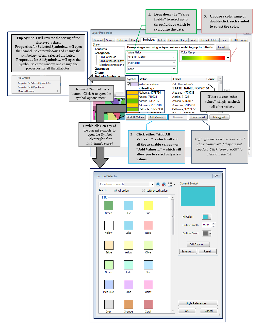
Unique Values, Many Fields
“Unique Values, Many Fields” will color features based a combination of two or more fields creating a unique value. For example, a layer containing crime data might have a field for the name of the neighborhood and another with month names and a third with reported armed robberies. There might be then be a feature with a three field combination of “Central Heights, January, 27” and another with a combination of “Central Heights, February, 14”. Even though we see “Central Heights” twelve times, each three field combination creates a unique value, which each polygon can be symbolized by.
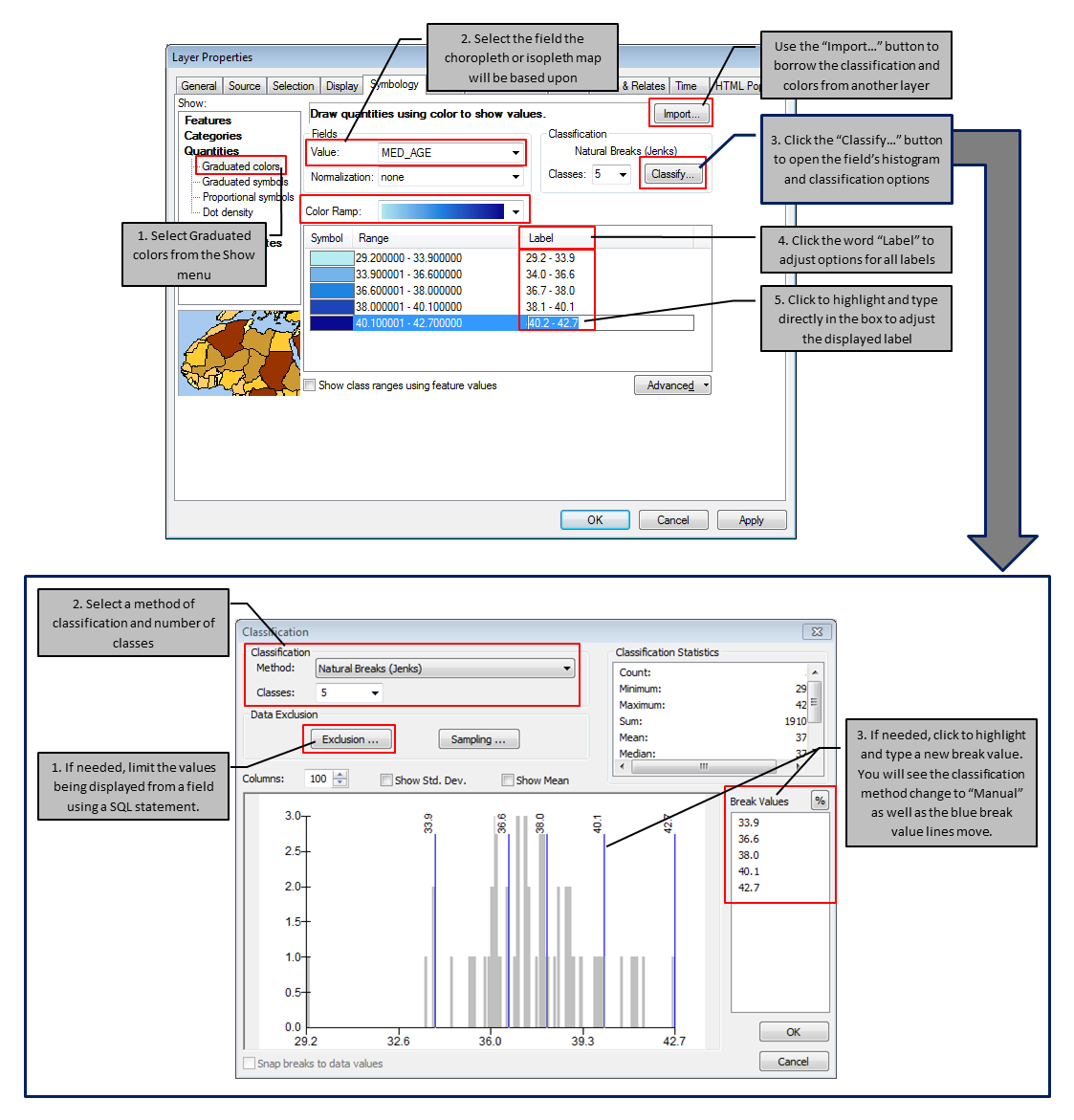
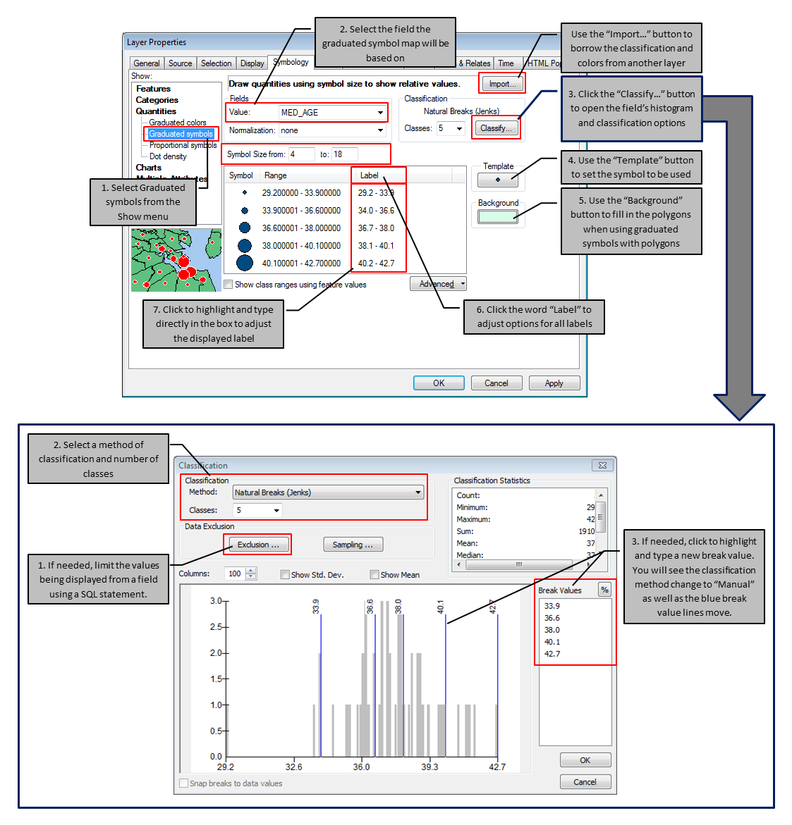
Symbology Show: Menu - Quantities
To display your map as an choropleth, isopleth, proportional symbol, graduated symbol, or dot density map, first open the Symbology tab in the layer’s properties. Once there, select “Quantities” from the “Show” menu and choose one of the four options (choropleth and isopleth are both found under “Graduated colors” and differ based upon the classification method).
Choropleth and Isopleth Maps - Graduated Colors
Based upon the frequency distribution of the data, the “Graduated Colors” portion of the Quantities menu utilizes the field’s histogram to set the break values for classification. When we use the “Equal Interval” classification method, the result is an isopleth map, while all the other methods result in a choropleth map.
Graduated Symbol and Proportional Symbol Maps
Proportional and graduated symbol maps represent both geographic location and an attribute value for a single location, utilizing a symbol size to represent either an exact value (proportional) or to represent a class of values (graduated). For example, you could represent both city location and population with a graduated symbol. The symbol will sit at the geographic coordinates (often the city center) and the size of the symbol will represent the population - a small symbol will represent a lower population than cities with a large symbol.
Both proportional and graduated symbol maps can clearly display a message without too much analysis needed on the part of the reader. Large symbol, large number, small symbol, small number. Easy peasy. However, this style of map can quickly get out of control by attempting to place too many symbols on one map, too many symbols in a small geographic area, pointlessly using a representative symbol when a choropleth map would accomplish the task cleaner, or using symbol sizes which are too large or do not have enough distinction between the high and low values. When used with caution and in combination with a choropleth map, proportional and graduated symbol maps can be done very neatly with a powerful, crisp message.
Graduated Symbol Maps
Proportional Symbol Maps
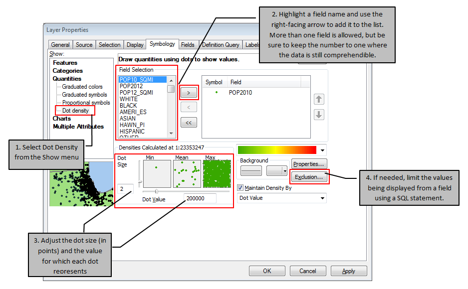
Dot Density Map
Dot density maps are a representative data thematic map, where one dot on the map represents one or more occurrences of a single attribute value. Within ArcMap, you can adjust how many values a dot represents and the size of the dot (small size for large amounts of data and vice versa) for one or more fields. As with all mapping techniques, the amount of dots and how many fields are represented should be based upon the purpose of the map and how the visual outcome will present itself to a reader.
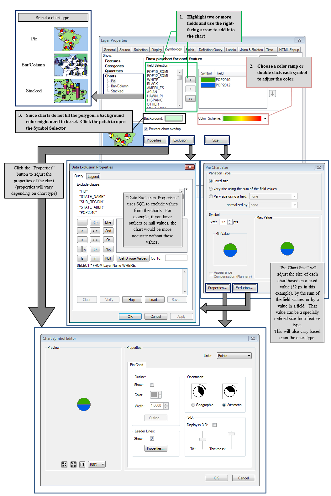
Symbology Show: Menu - Charts
Two or more values can be represented with a chart per feature as a symbology option. For each point, line, and polygon in a layer, a pie, bar/column, or stacked chart. Once the chart has been set, there are options to adjust the size and colors, exclude certain values if they exist in the field but do not pertain to layout, and orientation. Even though the below example displays a pie chart, each of the three chart types will have slightly different options.
From the Table of Contents
Single left-clicking on a patch (point, polyline, or polygon) in the Table of Contents will launch the Symbol Selector dialog box, which allows you to make many changes in the size, color, and style of a single symbol, as well as create your own symbols.
- Items such as color, outline width, line weights, and advanced symbol editing (via the Edit Symbol... button) can be found here
| Right clicking on the symbol’s example below the layer name will open the color selection dialog box. This only allow you to change the color of the selected symbol. | 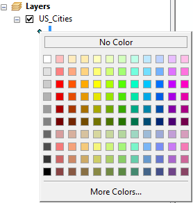 |
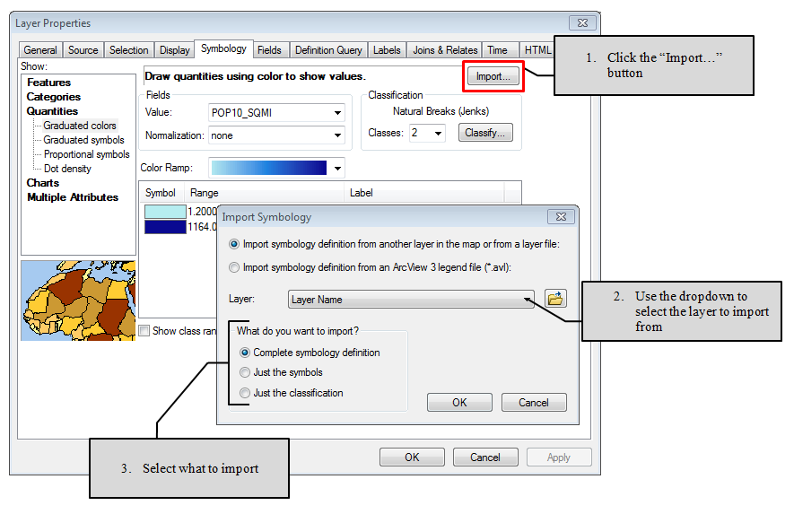
Importing Symbololgy
Often, two or more layers are used to express the same idea in two or more data frames. It would then be necessary to use the same symbology, classification, and legend labels to express the ideas across two or more areas. Instead of attempting to accomplish this by hand, ArcMap offers an option to import the entire symbology definition, just the symbols, or just the classification from another layer.
From the Symbology tab of the in the Layer Properties of layer you want to import to, click the “Import...” button, select the layer to borrow from, and choose what to import. That was easy.
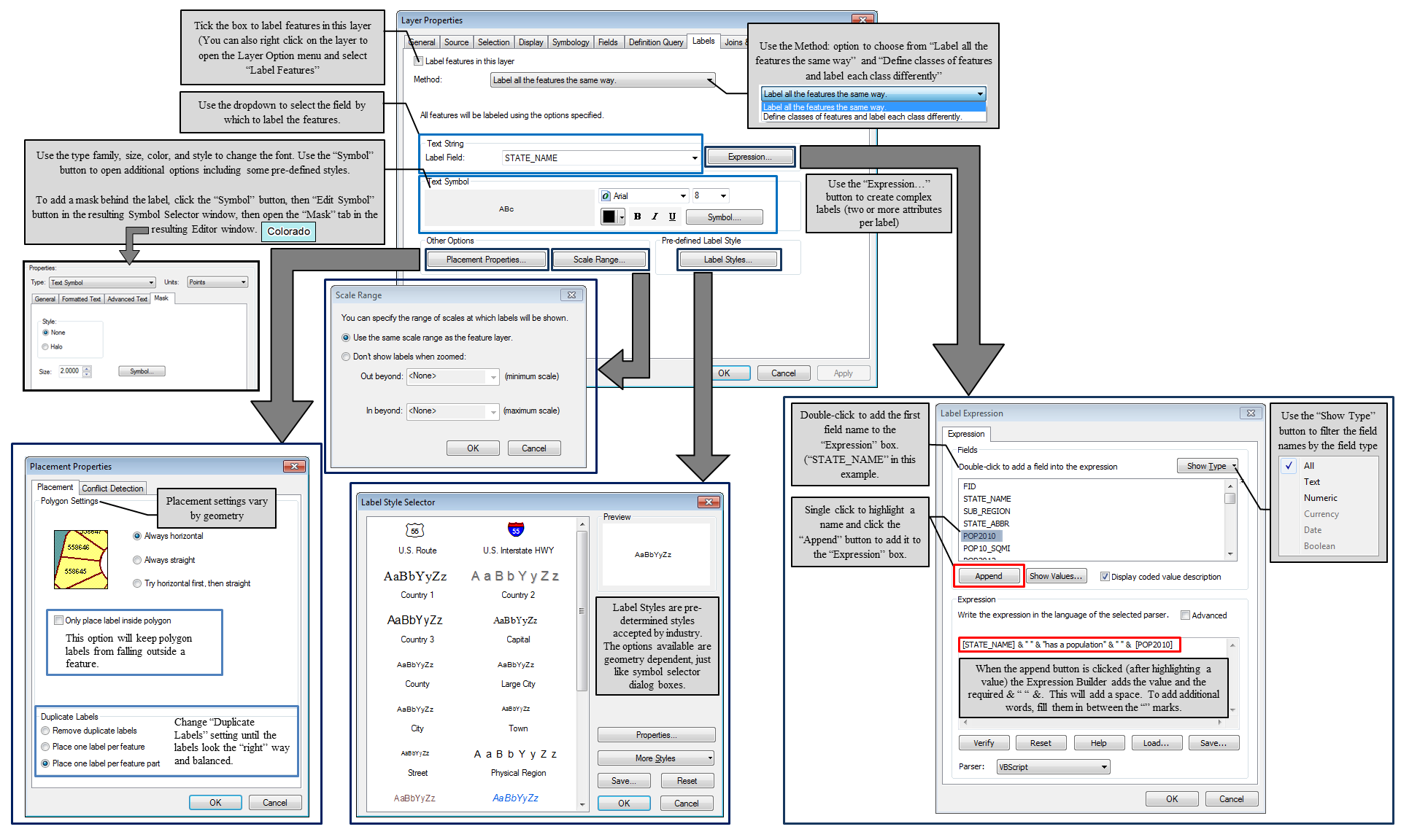
Labeling Features
Labeling features is one of the most important things we do in cartographic layouts. While there are lots of options and adjustments within the Labels tab, the basic operation to add labels to a layout are:
- Open the Layer Properties and the Labels tab
- Place a checkbox in the “Label features in this layer”
- Drop down the “Label Field” to find the field which to label by
- Adjust advanced options as necessary
Advanced operations can be found through the various menus available by clicking on the buttons.
- Placement properties controls how the labels draw on the map. The options in this menu are geometry dependent, meaning that points, polylines, and polygons all have different options.
- Scale Range defines at what zoom levels the scales will appear and not appear.
- Label styles contains pre-determined styles for several features. Like the placement properties, the available styles are geometry specific.
- Using the Expression options, complex labels utilizing two or more attributes and any additional words or numbers.
- Open the Expression dialog box
- Double-click a field name to add it to the Expression box
- To add another field name, single click the name to highlight it, then click the “Append” button. The tool will add the required & ” ” & needed to concatenate the two field names.
- To add additional words or numbers, type them in between the double quotes “”
- Verify the expression to check for errors
- Save the expression for use later; load a previously saved expression.
Title, Subtitle, and Additional Text

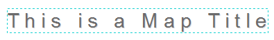
Every map, whether it is general purpose or thematic, should have a title*. The title should be short, descriptive, audience appropriate, and visually clear. Subtitles can be used if clarification is needed. Other title considerations should be spelling and grammar as well as choosing a font that is appropriate for the map, clearly readable, and large enough to say “title” without taking over the map. There are no specific rules about title placement - top and center is the most common place, but above the legend, along a left or right edge, and at the bottom of the map are all acceptable.
There are two ways to add a title to an ArcMap layout: with a text box (text boxes are also used for subtitles and additional text) or with dynamic text.
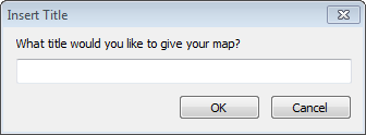
Dynamic Text
|
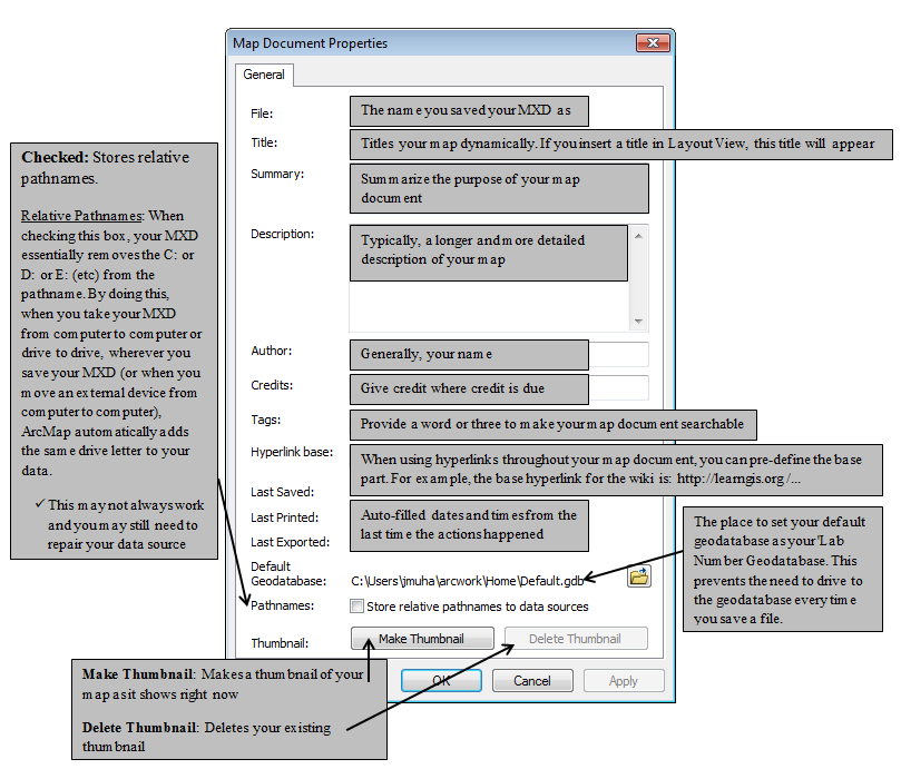
Dynamic text is one option in ArcMap layout that is added to the map and controlled in the map document properties. When dynamic text is set, elements can be added to a layout without need to type in the box (as if you did a text box). One of the more common dynamic text elements is the map title. After selecting Title from the insert menu, a pop-up will allow you to add a title to your map, but changing it will require you to access the dynamic text in the Map Document Properties, found in the file menu. If you double click on the title in the layout view, you will be presented with “<dyn type="document" property="title"/> ”, thus the need to use the Map Document Properties. |
 |
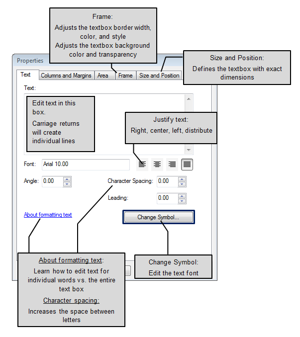
Text Boxes
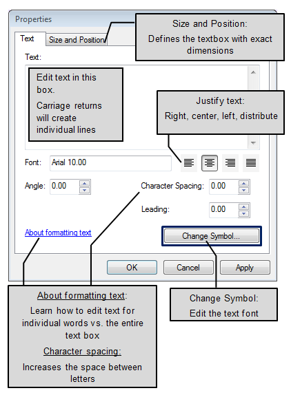
The other way to add a title - as well as subtitles and additional text - is using a text box. While a text box added from the insert menu, is usually better for adding titles, adding rectangle text from the Draw toolbar is usually better for subtitles and additional text. The text box options in the Draw toolbar are more robust, allowing for outlines, backgrounds, rectangular, polygon, circle, and splined text.
To make a simple text box
:
|
 |
|
 |
|
 |
To make a rectangular text box
|
 |
|
 This is just one example of the resulting rectangle text box. Yours may vary in frame and background color. |
|
 |
Neatline
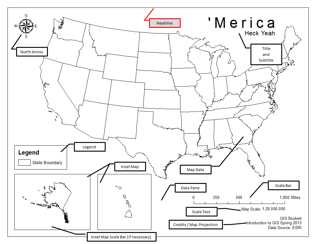
The neatline is a thin line that encircles each data frame on the final map. It’s job is create a boarder and define where the edge of the map is for both the main map and any inset maps that you may have. Neatlines, depending on the map, may be optional. There are times when the neatline can add to the map (like in the simple map of America above) and other times when it may draw a reader’s attention away from the main map data (like the example below). As new cartographers, it’s best to start with using a neatline every time and begin to experiment without them later.
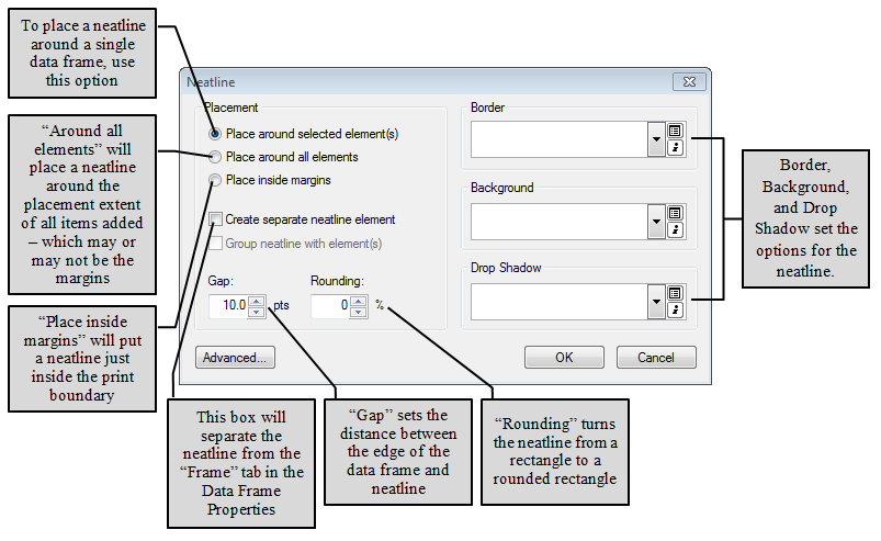
Adding neatlines to your layout is fairly easy, it’s a simple as selecting “Neatline” from the Insert menu. However, it’s necessary to understand the available options to place the neatline correctly.
When we look at the screenshot below, we see that there are three placement options:
- Place around selected elements
- Use this option to place a neatline around the selected data frame
- Place around all elements
- Use this option to place a neatline at the extent of all elements added to the map (data frames, north arrows, legends, text boxes, etc)
- Place inside margins
- Use this option to place a neatline just inside the printable margins
Other options include those to increase the gap between the neatline and the boundary of the data frame, the choice to round out the corners of the neatline, and select the line type and line weight (border) as well as a background or drop shadow.
Note: While this dialog box will allow you to add the neatline, unless you check the box for “Create separate neatline element”, you will need to use the “Frame” tab found in the Data Frame Properties to change elements of the neatline, which is also a second way to add a neatline “around selected elements”.
Customizing Legends Using the Legend Properties
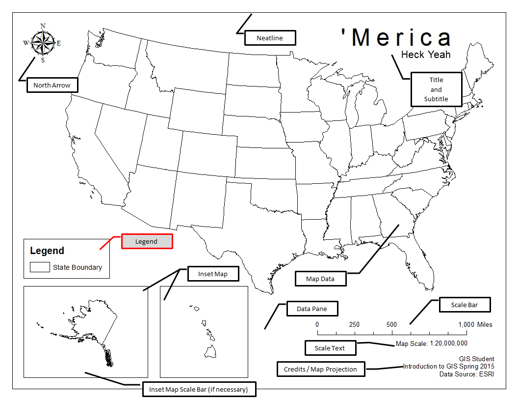
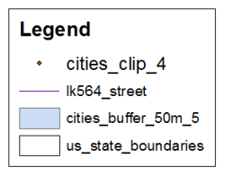
The general purpose of the legend is to define the symbols used in your map. As we will explore in the next section, all map data which is not an image or a basemap is represented by a symbol, and that symbol should be represented in the legend. As new cartographers, you should use a legend for each data frame and each legend should include a representation of each symbol that is important to understanding the map and a reader friendly description. It is not necessary to include every layer on your map, as some are used as reference such as state lines in a thematic map showing average population by state. A reader would expect the colors used to appear in the legend, yet “State Lines” is rather obvious in a map titled “Average Population by State”. As with neatlines, when your cartographic skills progress, the use of legends will become symbol and map dependent.
In most GIS software, ArcGIS included, layers can be renamed with a reader friendly alias to keep data organized while you are working with it as well as in the legend. A reader will better understand your map (and it will look much nicer) if the legend reads “Major Rivers” instead of “rivers_clip_JeffCo”. In ArcGIS, aliases can be assigned by slow left clicking on the name in the Table of Contents, which will allow you to type a new name or via the General tab of the Layer Properties.
 |
 |
| An example of a legend where care was not taken to make reader friendly labels. | An example of a legend with reader friendly labels |
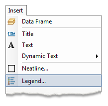
Adding and Changing Legends in ArcMap
While adding a legend in ArcMap is as easy as selecting “Legend” from the Insert menu and clicking “Next” in the resulting wizard, making a quality legend takes a little bit more time. In this section, we will add a legend, change the display names to “reader friendly” labels, adjust what shows for each item (layer name, heading, labels, and descriptions), change the swatch pattern, and look at the benefits and setbacks of converting your legend to a graphic.
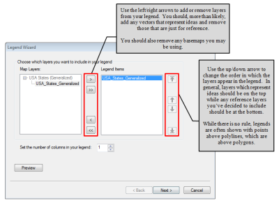
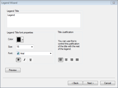
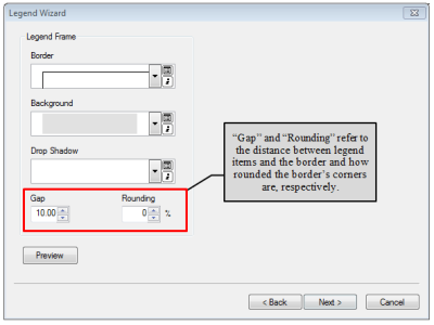
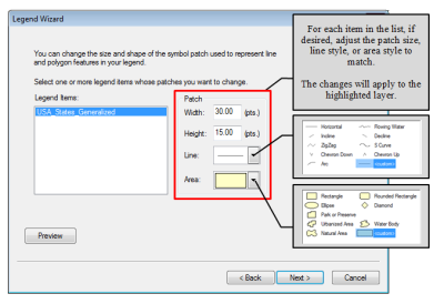
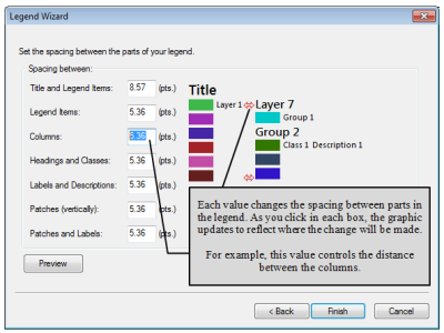
Use the Legend Wizard to Add a Legend
|
|
|
 |
|
 |
|
|
|
 |
|
 |
|
 |
|
 |
|
 Non-reader friendly names 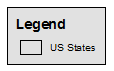 Reader friendly names |
Adjust Additional Legend Settings
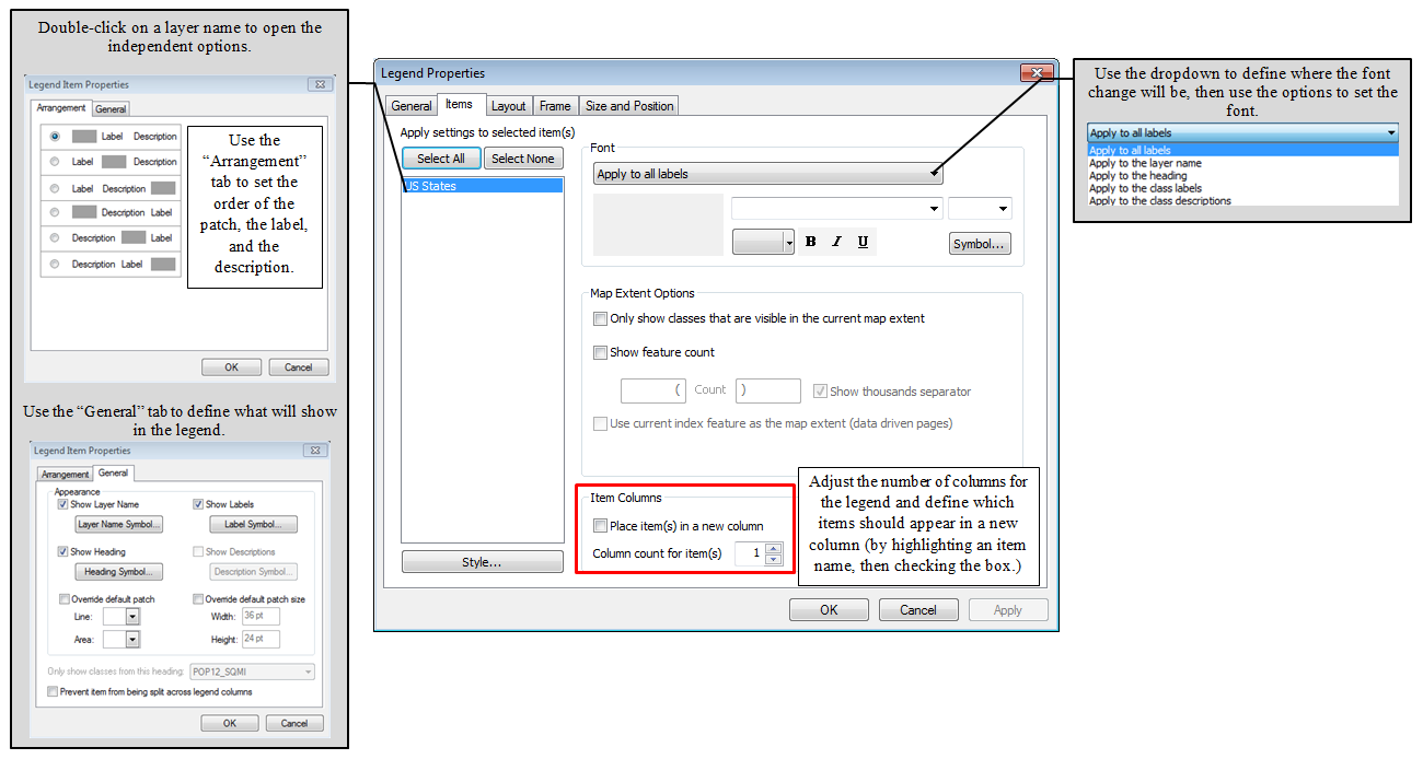
In addition to changing all of the settings found in the legend wizard after the legend has been created, there are some additional options in the Legend Properties to make it just right. Once the Legend has been created in the Layout view, double click to launch the Properties
Adjusting Individual Legend Items
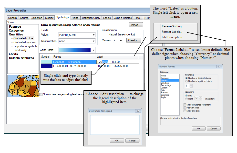
Once the legend is made, the layer name can be changed to a readable version in the Table of Contents (number nine above). However, when the symbology is set to use a field to clasifly data, that field name is shown in the Legend. It's possible to get rid of that field heading with just a few clicks.
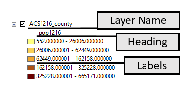
Changing Legend Feature Labels
The displayed legend feature labels can be changed within the Symbology tab. This is useful when adding layers to a Legend. Even though a layer might have an precision solved to nine decimal places, that is often overwhelming for the reader. When layers use coded values to represent features, the labels will automatically show those coded values. In order to explain the code to the reader, the labels can be changed without the need of creating/populating new fields
General Tab
In the “General” tab, you can adjust the legend’s title, the layers participating in the legend, and the order which they appear.
- Once you’ve put your layers in the order you wish them to appear, uncheck the “Reorder the legend items when the map layers are reordered” option. This will hold them even if you change the drawing order.
- Occasionally, you might need to have a legend item for a layer not being displayed. To accomplish this, uncheck the “Only display layers that are checked on in the Table of Contents” box. Then you can add additional layers from the “Map Layers” to the “Legend Items”.
- To prevent new legend items from appearing when a new layer is added to a data frame, uncheck the “Add a new item to the legend when a new layer is added to the map” box.
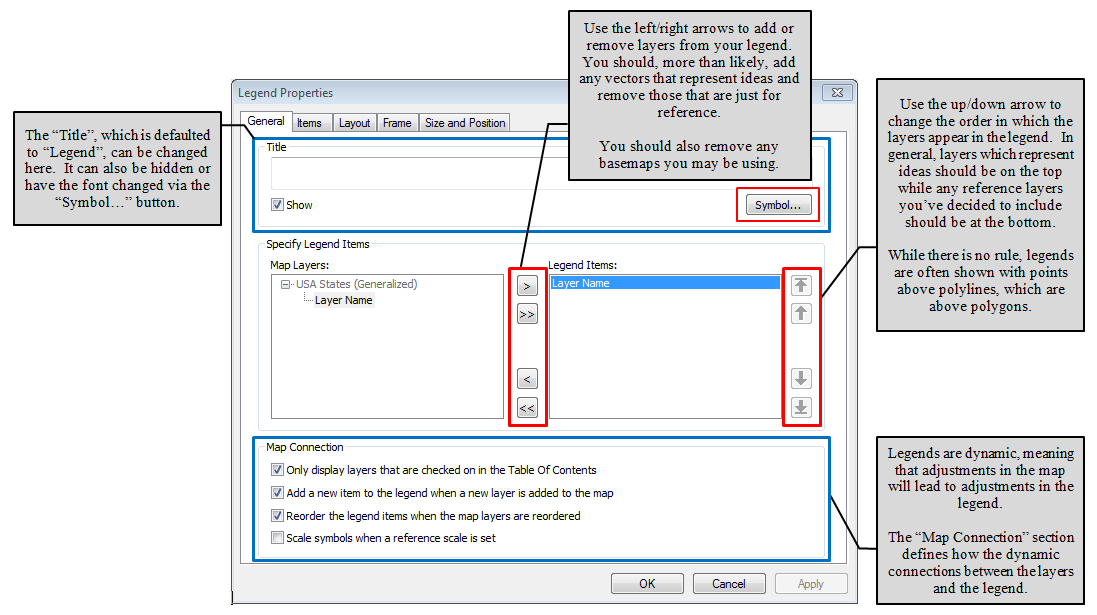
Items Tab
The “Items” tab will allow you to adjust variables for each of the layers independently as well as those to adjust variables to apply to the way all items sit in the legend. For example, each layer can be set to show the layer name, items labels, the field heading (if the layer is being displayed by classes or unique values), or the items descriptions (if applicable). The patch can be defined for each layer in this view, as well as the choice of how to arrange the patch, label, and description.
Options for adjusting variable that effect all the items together, such as the font (which can also be changed for each layer independently) and the ability to limit the legend to only layers visible in the current extent can be found in the items tab.
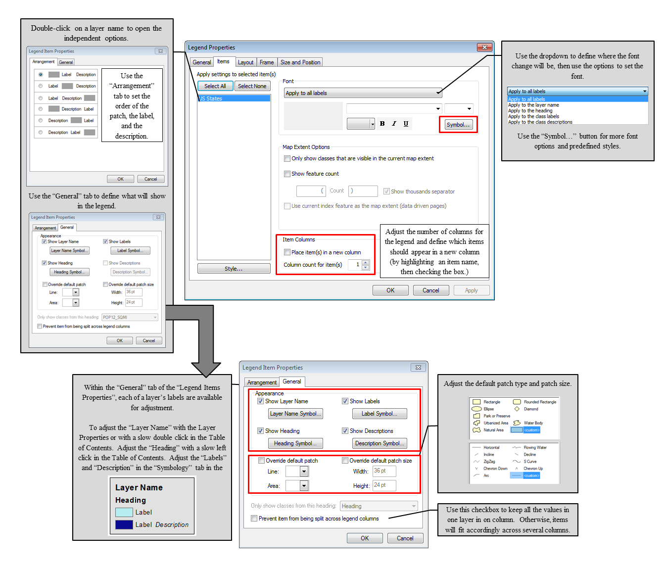
Layout Tab
The “Layout” tab controls the gap distanced between the different parts of the legend, the default patch type, width, and height, text wrapping, and fixed frame options. The gap distances (which are very large in the example due to the example legend being very large for screenshotting) are the same ones that were in the last page of the wizard. Adjusting each value will adjust a different distance. By clicking on a value, the graphic will change, showing where the change will effect the legend.
The default patch line, area, width, and height will change all of the patches in the legend vs the Items tab which allows for individual item adjustments.
Text wrapping will control how the labels and descriptions will wrap if they are too long to neatly fit.
The “Fitting Strategy” will control how the columns and contents will react when the frame size (found in “Size and Position”) is changed. To define a fixed frame (one that cannot be changed by dragging a corner of the legend) in the Size and Position tab, first mark this box.

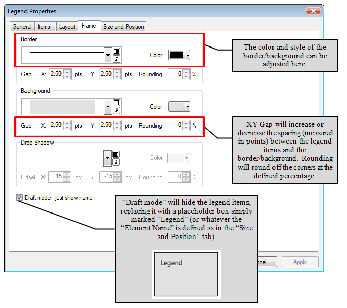
Frame Tab
The “Frame” tab will control the border, background, and drop shadow for the legend. The “XY Gap” (defined independently for the border and the background) will create more space between the items in the legend and the border/background. X Gap will increase the left/right space while the Y Gap will increase the top/bottom space. Rounding will control the rounding of the corners, again, dependently for the border and background.
“Draft mode - just show name” will hide the legend items, leaving just the background and border (if applicable) and the word “Legend”. This can help the drawing time of the layout, similar to “Toggle Draft Mode” in the Layout toolbar.
The Size and Position Tab
The “Size and Position” tab will define the fixed size and position in the layout of the legend. Size will adjust when the graphical legend is resized unless the “Fixed Frame” box it ticked in the “Layout” tab. The position will define where the defined anchor point of the legend sits in the layout using map inches. These numbers will change when the graphical legend is dragged around the layout.
Converting Legends to Graphics
One option in ArcMap is the ability to convert elements to graphics, meaning that object becomes a non-dynamic graphical object. If change are made to the layers in the Table of Contents, those changes will not be reflected in the legend. While this option is handy for things like creating non-traditional legends, if there is a means of making an adjustments in the legend options, that is how it should be done. Converting to graphics can be useful, but definitely more of a challenge for the new user. Get good at using the legend options, then use the convert to graphics option for everything else.
Legends can be converted to graphics by right clicking on the legend itself and select “Convert to Graphics”. The graphic can then be ungrouped and each element moved, deleted, or copied. After they are in place, the elements can be then regrouped.
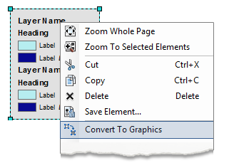 |
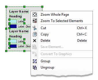 |
| Right click and select “Convert to Graphics” | The legend can then be ungrouped. After the elements are placed, they can be the regrouped |
North Arrows
![]()
A map’s north arrow is designed to show north relative to your map. While this may seem rather elementary, there are times when it may not be clear due either to the map’s content or the actual data frame has been rotated to better display the concepts or content.
General reference maps will almost always have a north arrow due to the navigational nature of the map type. Thematic maps allow for more choice on the cartographer’s part - if the map benefits from the north arrow, it should be present, if it is simply a space filling element, it should likely be left out.
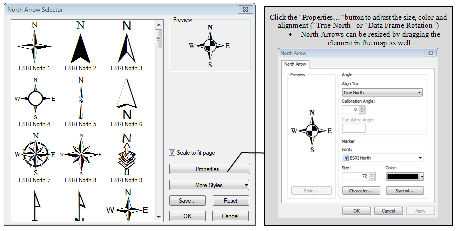
GIS software often offers a large variety of pre-existing north arrows in the cartographic layout section. When selecting a north arrow, it is best to first consider the audience and map purpose before making a selection. Nothing will make your map like care was not taken then a cartoonish north arrow on a serious subject map.
North arrows, as a map element, serve the purpose of enhancing the data and clarifying the map’s intended direction, especially when that varies from what might be expected. North arrows are not, however, a space filler. If you look at your map and think “Holy North Arrow, Batman!”, your north arrow may be too big and you might want to consider reducing the size, adjusting the map’s layout, and resizing the more important elements to take up the white space.
To add a north arrow in ArcMap, launch the North Arrow dialog box from the Insert menu, select one, and adjust the properties.
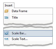
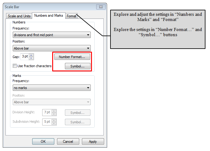
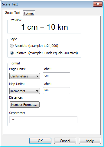
Scale Bars and Scale Text

Scale bars and scale text are another example of a data dependent map element. Like the north arrow, it is most likely a good idea to include both a scale bar and scale text on a general reference map, but thematic maps may not always benefit from one. A map showing an attribute that doesn’t deal with scale or the scale might not matter, such as in a map showing average wheat yield per state. With a wheat yield map, the ability to measure the length of Kansas is most likely not important and a scale bar may just be taking up white space.
- Scale bars, unlike scale text, will remain true on a map that has been resized outside of the GIS. This should be kept in mind when making the choice to include scale text along with a scale bar or not.
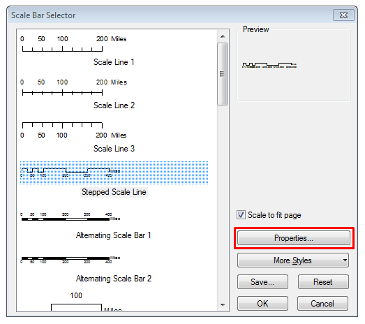
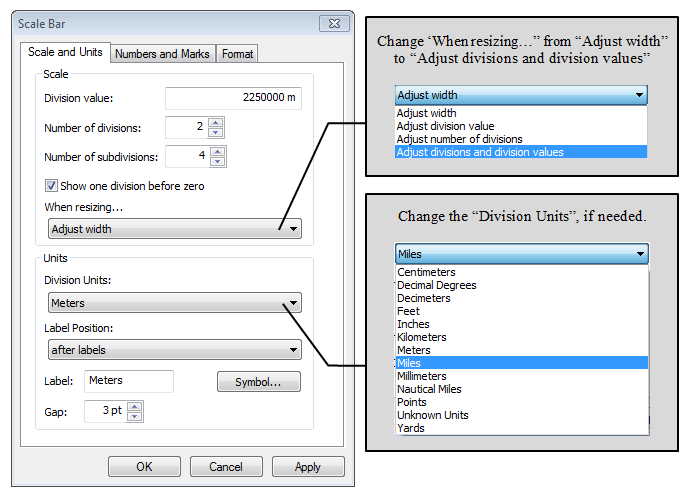
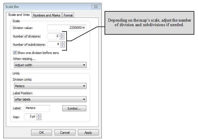
- When selecting a scale bar, choose the one that shows the information without detracting visually from the map. Care should also be taken to adjust the division values to show numbers that make sense to a reader (0.25 miles, not 0.3827 miles) as well as selecting a unit of measure that matches the map and is logical to the reader (not leaving a scale bar in decimal degrees).
 |
 |
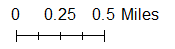 |
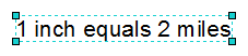
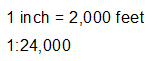
| An example of scale text in both a statement of equivilency (top) and a representative fraction (bottom) | An example of a scale bar where care was not taken to adjust the values to make sense to a reader | An example of a scale bar where care was taken to adjust the values. |
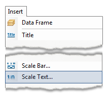
Adding Scale Bars and Scale Text in ArcMap
Scale Bars
|
 |
|
 |
|
 |
|
|
|
 |
|
 |
|
 |
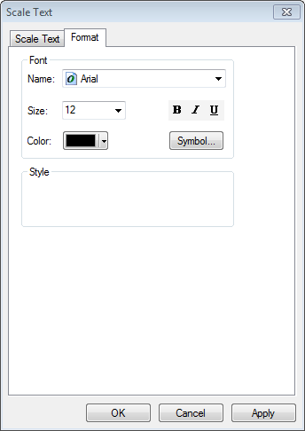
Scale Text
|
 |
|
 |
|
 |
|
 |
Credits, Date, and Projection
Cartographer Credits, Citation of Sources, and Date
Like a title, all maps should include credits. Cartographer credits may be the actual name of the cartographer, as in the case of a GIS 101 lab, or may be the organization the cartographer works for, such as the USGS or NOAA. Source credits should always be given whenever you do not create the data as it is assumed that the cartographer or someone in the cartographer’s organization created any data in the map which is not sourced to another organization. Source credits do not need to be long or detailed or necessarily layer specific. If you create a map with which you have layers from USGS and your GIS 101 class, a perfectly acceptable way to cite both sources is: “Data Sources: USGS and GIS 101 Lab Data”.
Dating the map’s creation is a required map element. A reader should know when a thematic map was created to consider if the material is still relevant or if they should be looking at it in a historic way. General reference maps tend to have a longer life span, but should still include a date - at least a creation year, if not month and year.
Credits and date should be presented in a clearly read font, avoiding scripts and typefaces such as Comic Sans, and the text size should be one that can be easily read without being a distraction. While the credits and date should always be included on maps, they shouldn’t be the star of the show, either.
Map Projection
Including the map’s projection in text from provides a reader with an idea of how the distortion is being presented. A reader may know that a thematic map presented in a Mercator projection will preserve shape - an excellent choice to present data with a large extent that doesn’t require the reader to navigate anything.
Like map credits, the projection should be a text size that is readable but no overwhelming and in a typeface that is not a script or inappropriate.
Using Text Boxes to Add Credits and Projection Text
For credits and projection text, unless you need to set a frame and background color, the easiest way is just to add a text box from the Insert menu, type in the information, and place a carriage return (the enter key on the keyboard) between each line.
If you need to set a frame and background, see the instructions in the “Titles and Subtitles” section to draw a Rectangle Text. You most likely will want to avoid “Polygon Text” and “Splined Text” for credits and projections, however, it’s not out of the question if you use cartographic discretion.
|
|
|
|
|
|
|
|
|