Before we get into the groups of geoprocessing tools, we are going to stop by the idea of classification. Back in Chapter Three, when we were first learning about the properties of raster images, we looked at the idea of classified rasters, or rasters which instead of showing an actual image of the landscape, instead showed a series of colors and numbers which represent groups or classes of landscape features such as a Class 1/red: rivers, lakes, and clouds; Class 2/blue: urban areas; Class 3/green: soil and exposed ground; and Class 4/yellow: trees and shrubs. This concept of classification doesn't end at rasters, however, and is used for all types of GIS Geographic Information Systems the software used to create, store, and manage spatial data, analyze spatial problems, and display the data in cartographic layouts Geographic Information Sciences data: vectors, rasters, and data tables, with basically the same meaning: grouping values together to show concentration of similar data. Several raster and vector geoprocessing tools utilize the idea of classification, as well as several cartographic methods. As long as there is data in the attribute table of either numeric values (rasters, vectors, data tables) or alpha-numeric values (vectors and data tables only), the data can be classified and the spatial data (rasters and vectors) expressed visually to match those classes (we learned in earlier in this chapter that data tables can always be joined to spatial data if there is a field in common to be able to express those data tables in a spatial way).
There are several methods we use to create the classes for the data and decide how the values (numeric and alphanumeric) present in the attribute table fit into each class. Each method has it’s place and choosing a method is based upon several factors such as the map purpose, the distribution of the data, and the result of each on as it pertains to understanding the non-spatial data Attributes related to a location but not describing its physical placement in space, such as information about a tree's age, type, and health. values presented in a spatial way via map colors.
The most common methods are (like many things we learn in Vector Based GIS Geographic Information Systems the software used to create, store, and manage spatial data, analyze spatial problems, and display the data in cartographic layouts Geographic Information Sciences , there are more methods then those presented here, however, we are not trying to learn the entire software and all of it's capabilities in just a few short weeks!):
- Raster (Reflectance) Classification
- Numeric Based Classification
- Equal interval
- Quantile
- Mean-standard deviation
- Jenks Natural Breaks
- Custom Intervals
5.11.2: Raster (Reflectance) Classification
Before we can look at how classification rasters become classified, we need to first explore some basic ideas behind light and color, which will come up again in this class during the "Principles of Color" section of Chapter Nine: Principles of Cartography, in your cartography class - if you are taking one, and in your Remote Sensing class - if you are taking that (and with a huge amount of detail). If you are not intending to either Cartography nor Remote Sensing, then this overview of how color works is going to be more then enough to get you through the concepts of classification and cartography. The idea behind how colors are created is a bit of a tough one, but not any harder then learning what a geoid a model of the variation between global mean (average) sea level and local mean sea level the measurement above or below the global average at a single point A GIS vector data in any sort of digital science or art, is simply denoting a type of graphical representation using straight lines to construct the outlines of objects geometry type which is made up of just one vertex pl. vertices One of a set of ordered x,y coordinate pairs that defines the shape of a line or polygon feature. , marking a single XY location in any given geographic or projected coordinate system. on the Earth's surface used for recording the elevation of topographic surface a detailed map of the surface features of land. It includes the mountains, hills, creeks, and other bumps and lumps on a particular hunk of earth. The word is a Greek-rooted combo of topos meaning "place" and graphein "to write." 's relief the difference between the highest and lowest point within a particular area while landforms are the descriptive words for individual features , which is used to measure precise elevations on the topographic surface a detailed map of the surface features of land. It includes the mountains, hills, creeks, and other bumps and lumps on a particular hunk of earth. The word is a Greek-rooted combo of topos meaning "place" and graphein "to write." is and why we care!
Light is a product of two kinds of energy, a combination of electricity and magnetism or electromagnetic energy, in which said electricity and magnetism travel in waves perpendicular to each other (electricity travels along an Y axis while magnetism travels along the Z axis) from a source, such as (primarily) the sun, a computer monitor, a light bulb, a flashlight, etc.
| Figure 5.22: A Model of Electromagnetic Energy |
|---|
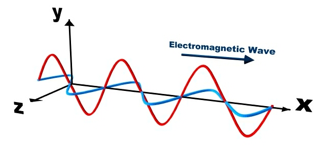 |
| Electromagnetic energy is a product of an exothermic reaction which then travels from a source in a waves, with electricity and magnetism traveling perpendicular to each other. |
All of these sources of light that you have been exposed to your entire life are a means of creating electromagnetic energy via an exothermic reaction, or a internal reaction which produces both light and heat (and magnetic energy, but we don't deal with that portion in GIS Geographic Information Systems the software used to create, store, and manage spatial data, analyze spatial problems, and display the data in cartographic layouts Geographic Information Sciences or Remote Sensing). After release from the exothermic reaction, the electromagnetic energy travels away from the source towards (for our purposes) the surface of the Earth, where it makes contact with objects (plants, people, the ground, buildings, etc), and those objects either reflect, absorb, or allow the energy to pass through (transmission). All objects deal with the electromagnetic energy in all three ways, for example, when a window absorbs energy, it can be felt by a person as a heated surface, when the energy is transmitted, objects can be seen through the window, and yet, a person can still see the window itself, since it is reflecting energy at the same time. In GIS Geographic Information Systems the software used to create, store, and manage spatial data, analyze spatial problems, and display the data in cartographic layouts Geographic Information Sciences and Remote Sensing, we are really only interested in the energy which is reflected from the object. Reflected electromagnetic energy can be captured by any sensor designed to capture such energy, such as a satellite camera or your eyes, and since those sensors generally do not come in direct contact with the object, we can say that the sensor is remotely placed away from the object (hence: remote sensing!).
How the sensor collects and processes the reflected energy is really how we begin to understand the ideas of color theory and classification. Just like the ocean wave size varies based on the weather (short, slow rolling waves during calm times and huge, rapidly crashing waves during a hurricane) and we classify weather based upon what is happening outside (calm times and hurricanes), electromagnetic energy waves also vary their height and distance between peaks and valleys in relation to their energy, creating a spectrum from very small (gamma rays) to very large (radio waves). We call the measurement between one peak and the next of a single wave the wavelength and we use those wavelengths to create a complete classification of the entire range of electromagnetic waves known as the electromagnetic spectrum.
| Figure 5.23: Measuring Wavelength and The Electromagnetic Spectrum | |
|---|---|
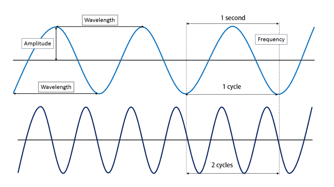 |
 |
| Waves are measure in three ways: wavelength, amplitude, and frequency. Wavelength is the distance from either peak to peak or valley to valley. Wavelength determines where on the electromagnetic spectrum we place the energy and categorize it accordingly. Frequency is how many single waves pass a single spot over a given amount of time. Frequency also determines the place along the spectrum an energy wave lands for means of categorization. Wavelength and frequency are indirectly related, meaning that as one increases, the other decreases. A high frequency equates to short wavelength, while a low frequency equates to a long wavelength. Amplitude is the height of the wave, which determines the amount of energy the wave contains. Amplitude is an independent variable from frequency and wavelength. In the world of visible color, amplitude determines how bright the light is. More energy, the brighter the light, less energy, the dimmer the light. It is possible to have a very bright blue light, and a very dim light in the exact shade of blue. Think about the low and high headlights on a car with "those" blue headlights. The low and high are the same shade of blue, just one setting is dimmer then the other. | The electromagnetic spectrum is a graph showing the correlation of wavelength and categorization. The waves are measured and placed along the spectrum. The categories correspond to how the spectrum is used in a variety of sciences. We use just a few of the categories in Remote Sensing and GIS Geographic Information Systems the software used to create, store, and manage spatial data, analyze spatial problems, and display the data in cartographic layouts Geographic Information Sciences . |
When we understand three very important things about the interaction of objects and electromagnetic energy:
- objects deal with 100% of the electromagnetic energy by absorbing a percentage, transmitting a percentage, and reflecting a percentage;
- the measured wavelength of the reflected energy falls somewhere along the electromagnetic spectrum; and
- different sensors are capable of collecting energy along different portions of the electromagnetic spectrum;
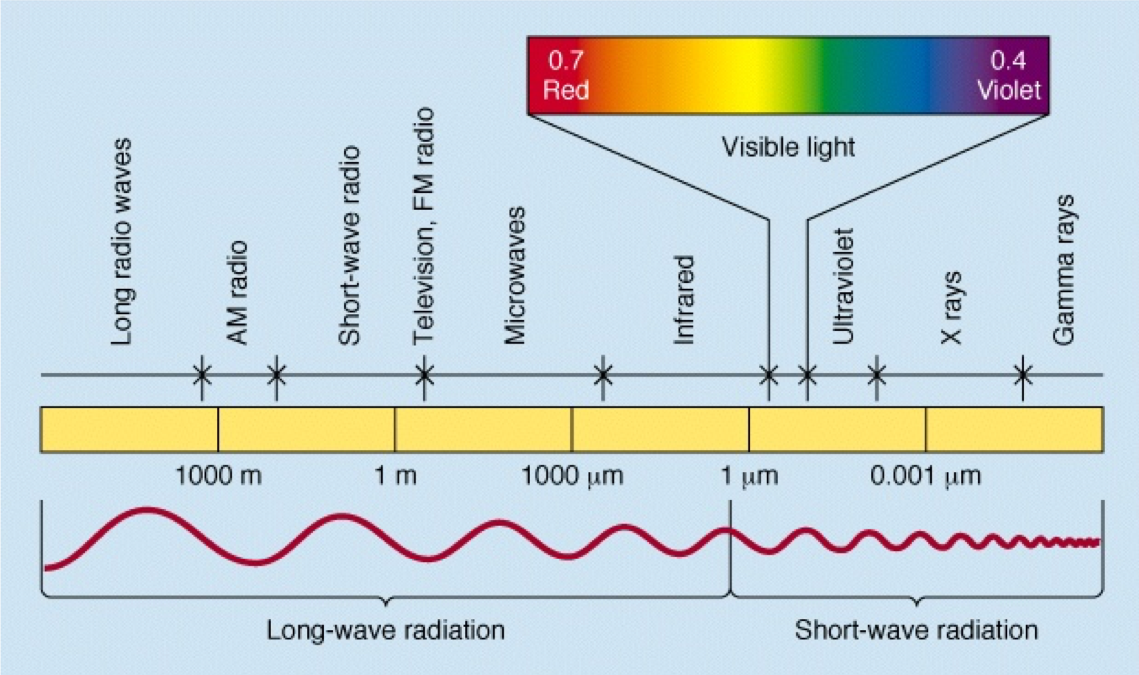
we can recognize and identify objects based on known reflectance values, or exactly what we just said: the known percentage of reflected energy and where it falls along the electromagnetic spectrum. In GIS Geographic Information Systems the software used to create, store, and manage spatial data, analyze spatial problems, and display the data in cartographic layouts Geographic Information Sciences and Cartography, we really only deal with the very tiny portion of the electromagnetic spectrum known as the visible portion, or the portion of the spectrum which is detectable by the human eye and perceived by the brain as color (very tiny indeed! If the electromagnetic spectrum were to be stretched out into a straight line which runs from Los Angeles to New York, the visible portion would equate to a section the length of a dime!). Even though you think you've been living in a rainbow world for your entire life, the visible portion of the spectrum really only consists of three colors: red, green, and blue. When the entire percentage of reflected light from an object falls in the red portion of the spectrum, your brain sees the color red. When the object reflects object totally in the blue portion, you see blue, and when the object reflects totally in the green portion, you see green. It's not until objects divide their reflectance between two or more portions of the visible spectrum that you see colors other than red, green, or blue. This blending of colors sensed by cameras and your eyes is called the additive color theory. When you wear a burgundy college t-shirt, the cloth is dyed in such a way that it absorbs electromagnetic energy, specifically including blue and green light and reflects red light. This red light enters your eye, strikes the red sensitive cones in the back of the eye, and the cones tell your brain “red”. If you’ve paired your college t-shirt with a pair of black pants, those pants are dyed in such as way that they absorb all of the colors (red, green, and blue) and no light is left to reflect and enter your eye, no cones are activated, and your brain is told “no input = color absent = black”. When you’ve topped off your outfit with a crisp white Sports Team hat, the light energy strikes the dyes (or absence thereof) in the cloth, all three colors are reflected and enter your eye, strike the red, green, and blue cones at equal amounts essentially “overloading” them, which tells your brain “All cones activated - cannot differentiate one over the others — call this color ‘white’”. If the Sports Team logo is magenta and yellow, for the magenta sections, the red and blue waves are reflected while green is totally absorbed and in the yellow sections, the green and red waves are reflected while the blue waves are absorbed.
This Additive Color Theory is the additive color theory - seeing color by adding the reflected waves together. The additive color theory is opposite of the subtractive color theory - creating dyes and pigments in such a way that they will absorb and reflect color according to the additive theory. When you were in grade school, you learned that mixing yellow and blue pigments together will make green pigment, which is totally true - but in the end, the green pigment’s job is to reflect green light while absorbing red and blue light.
| Figure 5.24: The Additive Color Theory and the Structure of Cones and Rods | |
|---|---|
 |
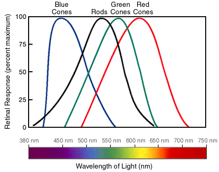 |
| With the additive color theory, the color of the light reflected from an object determines the color. By mixing two of the colors, other colors can be seen. This graph shows the basic six colors we get from three colors of light, but (obviously) other colors can be made by mixing different percentages of two colors. | Your eyes contain two main structures to sense color and light - cones and rods. In the graphic, we can see how each cone is associated with different wavelengths of electromagnetic energy, or as you know them, the colors. Your brain mixes the light of different wavelengths in whatever percentage they are being reflected from an object at, which it then translates into the colors you see. |
We learned that all objects reflect, absorb, or transmit electromagnetic energy and that the reflected energy can be classified along the spectrum based on the wavelength, and it's also important to understand that objects reflect, transmit, and absorb energy doesn't neatly fall in a single portion of the spectrum, but instead across the spectrum. When the reflectance is collected and categorized for a single type of object, such as Coastal Redwood (Sequoia sempervirens), the result is a spectral signature of the object, which is really just a means of cataloging the wavelength of the values and charting in a unique way. In the following figure, we see a several everyday items, such as asphalt, trees, and gravel. Along the X axis of the graph, you can see the different wavelengths, which determines the color or category of the electromagnetic energy. The Y-axis shows the percentage of reflectance. The signature is the distinct line created by charting the percentage of reflectance at each wavelength for the specific material. Related materials will have a spectral signature which is very similar in the pattern across the graph, with small variations in specific reflectance. For example, we see the "trees" spectral signature in Figure 5.25 with a pattern where the line is slightly up around 10% of reflectance at about 0.42 micrometers, then a bit of a fall, then a small hump between 0.50 and 0.60 micrometers (which, by the way, relates to the color green), and a trend back down around 5% of reflectance until 0.70 micrometers, where the line shoots straight up, finally leveling off to a reflectance of about 50% for the remainder of the line. This pattern of up, down, up, down, huge up, level off is the same pattern we see with all healthy and live plant material. The variations between species come down to single percentage changes in reflectance, not the overall pattern of the entire signature.
| Figure 5.25: An Example of a Spectral Signature |
|---|
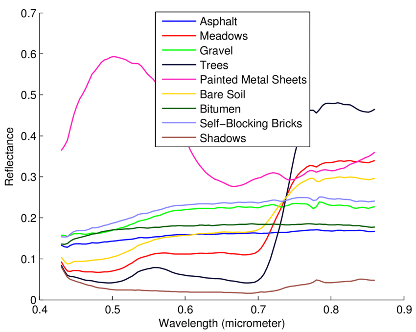 |
As promised, the basic understanding of how the spectral signature of a material is created and how additive color theory works will come again, both in this class and in your remote sensing class. In regards to classification rasters (oh yeah! That is what this section is about!), objects with similar spectral signatures are grouped together into a single class, being represented by a numeric value and an arbitrary color (Class 1/Red: rivers, lakes, and clouds; Class 2/Blue: urban areas; Class 3/Green: soil and exposed ground; and Class 4/Yellow: trees and shrubs). This is one means of raster classification, however, one could export the raster classes to vector features and classify the polygons in the same manner (to answer your question, in the GIS Geographic Information Systems the software used to create, store, and manage spatial data, analyze spatial problems, and display the data in cartographic layouts Geographic Information Sciences , we can only run raster tools on rasters and vector tools on vectors. If you would like to compare two layers, such as a Land Use/Land Cover raster - a specific classification raster we looked at in a lab - and a river buffer layer, you'd need to get the two layers in the same form: raster or vector depending on what your next moves are).
5.11.3: Numeric Classifications
Numeric classifications are a group of functions which examine the stored numeric values in the attribute table and organize the data based on grouping those values together in related ways. We have five main kinds of numeric classifications we use with GIS Geographic Information Systems the software used to create, store, and manage spatial data, analyze spatial problems, and display the data in cartographic layouts Geographic Information Sciences data: equal interval, quantile, mean-standard deviation, Jenks Natural breaks, and manual classifications. Jenks Natural Breaks is the ArcGIS default, but that doesn’t mean it's the most correct option every time. Often times, a technician will look at several of the options and decide which one best fits the data they are trying to express. The following classification methods are not the only options, but the most common options.
Equal Intervals
Equal interval classification breaks the range of the data set into equal chunks based on the number of desired classes, leaving each class to span the same range of values on the number line. In other words, each class has an equal number of slots that data could occupy, such as Class 1: values 1-10, 2 members; Class 2: values 11-20, 57 members; Class 3: values 21-30, 22 members; and Class 4: values 31-40, 15 members. This type of classification works quite well for continuous data A continuous surface represents phenomena in which each location on the surface is a measure of the concentration level or its relationship from a fixed point A GIS vector data in any sort of digital science or art, is simply denoting a type of graphical representation using straight lines to construct the outlines of objects geometry type which is made up of just one vertex pl. vertices One of a set of ordered x,y coordinate pairs that defines the shape of a line or polygon feature. , marking a single XY location in any given geographic or projected coordinate system. in space or from an emitting source. . The audience already comprehends the data in equal chunks, such as percentages or temperatures, thus providing a classification that matches the common understanding will prevent the reader from having to analyze “funky chunks”.
| Figure 5.26: Example Data Set Using the Equal Interval Classification Method |
|---|
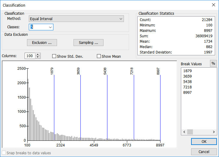 |
| According to the Classification Statistics (upper right of image), this data set has a minimum value of 100 and a maximum value of 8997 (the total number of records in just about 22,000). Using the equal interval classification method, each group has 1,779 slots for data to fit into. Looking at the graph, we can see the majority of the data falls into the first group, decreasing from there. Equal interval doesn't take into account the total number of features, but instead focuses on creating groups with an equal number of slots. |
Quantile
Similar to, but distinctly different from, equal interval classification, quantile classification creates classes with an equal number of values in each class. While equal interval is more concerned with breaking the number line into equal pieces, regardless if the class will contain any features or not, quantile classification is focused on making sure each class has an equal number of participants, regardless of how the classes are arranged on the number line. In other words, while equal interval classification has an equal number of slots for data to occupy, quantile has an equal number of members per class, regardless of how many numbers along the number line the class spans. For example, Class 1: 1-27, 15 members; Class 2: 29-31, 15 members, and Class 3: 31-100, 15 members.
Quantile data is well suited for data which is distributed fairly evenly to begin with. Using this method with data that is poorly distributed might lead to a misleading map. Since each class will have an equal number of features, some classes might be over-represented, spanning a long distance on the number line just to make sure the class contains enough features.
| Figure 5.27: Example Data Set Using the Quantile Classification Method |
|---|
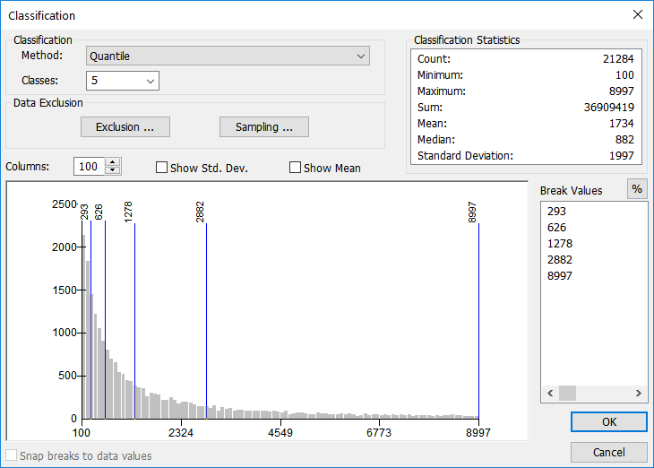 |
| The Quantile Method creates classes where each group has the same number of members, regardless of the number of slots. Similar to, but opposite of, the equal interval method which makes sure each group has the same number of slots, regardless of the members. |
Mean-Standard deviation
Every set of numeric data has a mean (average) and a standard deviation. In GIS Geographic Information Systems the software used to create, store, and manage spatial data, analyze spatial problems, and display the data in cartographic layouts Geographic Information Sciences , we can use these values to display how normal or abnormal the distribution of values is for that particular data set. Data which has a small standard deviation means the classes all cluster around the mean while data with a large standard deviation are spread across the number line without clustering. The GIS Geographic Information Systems the software used to create, store, and manage spatial data, analyze spatial problems, and display the data in cartographic layouts Geographic Information Sciences will calculate the mean and standard deviation, then break the number line into equal chunks, usually at one-quarter, one-third, or one-half of the standard deviation.
| Figure 5.28: Example Data Set Using the Mean-Standard Deviation Classification Method |
|---|
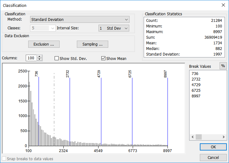 |
| The Mean-Standard Deviation classification method |
Jenks Natural Breaks
Natural breaks (the default classification method in ArcGIS) is aimed at classifying values based upon the natural grouping that exist in the data. No emphasis is put on creating classes with an equal number of values along the number line (equal interval), or creating classes that each have the same number of features (quantile), nor are the classes based upon a statistical mean and standard deviation (mean-standard deviation). Breaks occur in places where the data values just naturally group.
For example, if you were to ask your GIS Geographic Information Systems the software used to create, store, and manage spatial data, analyze spatial problems, and display the data in cartographic layouts Geographic Information Sciences class to stand in a group based upon their preference of one of three ice cream flavors - chocolate, strawberry, or vanilla - the class will naturally break into groups, without regard for how many people are in each group. If there were people in all three groups, you’d have three classes, but if no one was in the vanilla group, you’d only have two. (Since we are working with numeric data and not descriptive data, if you define 5 classes, the GIS Geographic Information Systems the software used to create, store, and manage spatial data, analyze spatial problems, and display the data in cartographic layouts Geographic Information Sciences will still create 5 natural classes - not eliminate a class because of a lack of data. The classes will just be smaller.)
| Figure 5.29: Example Data Set Using the Jenks Natural Breaks Classification Method |
|---|
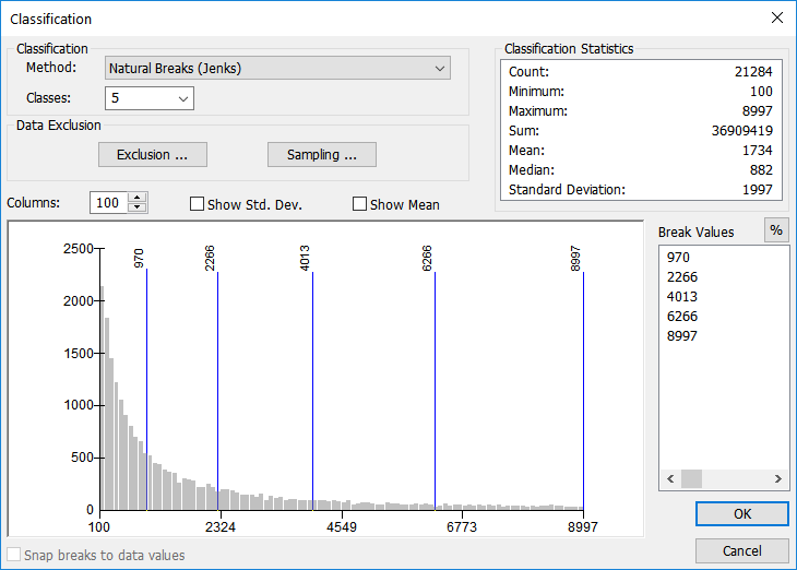 |
Custom Intervals
Custom intervals are just that: custom. If you have a project where each class has a defined value, for example, if that project was based upon wind speed for energy-generating turbines, the defined wind speeds might be “35 mph = Great”, “34-30 mph = Good”, and “29 and under = Not viable”. Basically, you don’t care about where the natural break or mean values are, for they do not fit into your project and classification needs. Sometimes, it’s a good idea to let the GIS Geographic Information Systems the software used to create, store, and manage spatial data, analyze spatial problems, and display the data in cartographic layouts Geographic Information Sciences use natural break to find break values that best describe the data, then use manual classification simply to round off values to an understandable value. In the end, the breaks are no longer in a “natural” place, however, your data will be better understood and comprehended by the audience.
| Figure 5.30: Example Data Set Using the Custom Interval Classification Method |
|---|
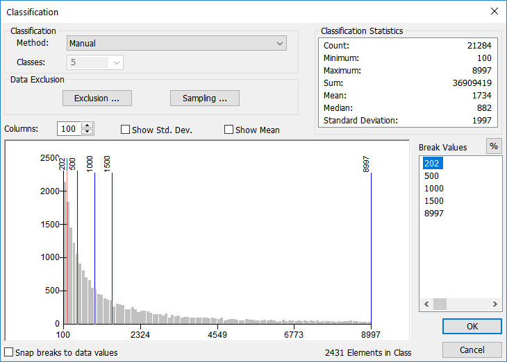 |
| This is again the same data, but using custom intervals. The decided values are of known importance to the user, regardless of number of slots, number of members, statistical breakdown, or natural breaks. The user enters the break values into the break value box in either absolute value (shown) or a percentage of the total (toggled via the % button in the Break Value portion of the window). |
5.11.4: Choosing the Number of Classes
Now that we’ve looked at several methods of classification, the next step is to decide how many classes to divide the data into. When you are first learning, it might be the best choice to allow the software to find the statistical or mathematical breaks in the data, but you should still examine and understand the way the data sits along the histogram. Each layer in ArcGIS is capable of displaying a histogram, or a graphical representation of the data along an XY chart.
Selecting the number of classes and the break values depend heavily on the distribution of the data. Overall, it’s always best to select the fewest number of classes that still express the distribution in an understandable way. Too many classes will clutter your map while too few classes will limit the understanding of your data. To best express most data and distinguish color differences in the output map, it’s best to stick to somewhere between 3 and 7 classes.
| Figure 5.31: Attribute Count Distribution Histogram |
|---|
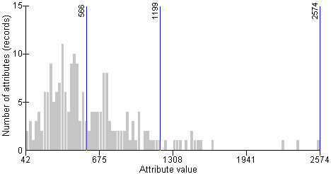 |
| The X axis (bottom) shows the range of attribute values for a specific field. The Y axis (left side) shows the number of features which have that value (the ''frequency'' of the value). Overall, we can compare the attribute value to the frequency to see the distribution of data. |